Skip to content


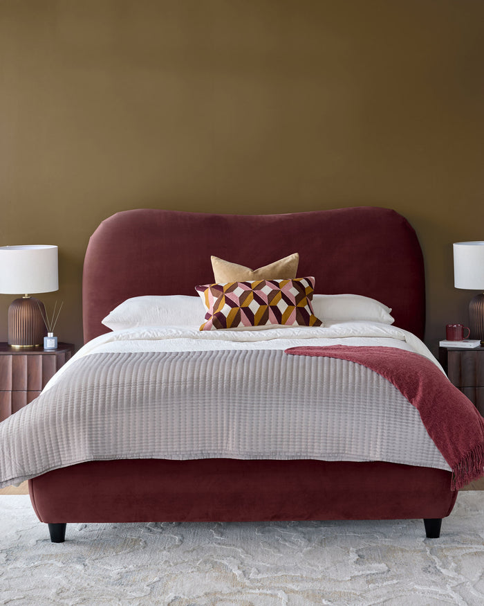
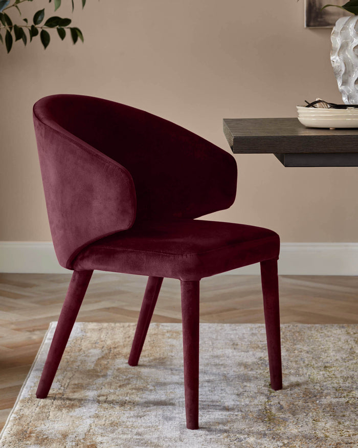
Plum is such a rich, deep shade that will instantly add a feel of modern cosiness to your home. In this trend edit, we’ve put together our expert advice on a number of creative ways you can incorporate this stylish shade into your bedroom, or dining area with our selection of plum dining chairs and beds.
Firstly, what colour is ‘Plum’?
Colour is subjective – what one might call ‘Claret’ another might call ‘Plum’. We’ve gone for Plum to describe what is a rich, warm colour that sits in the wine – claret – plum – grape spectrum of colour. Because it’s velvet the colour appears to have a tonal quality which makes the colour even more interesting.
Top tip when buying a sofa: Order a Free swatch! This is important because all computer screens and phone screens are calibrated differently. We match our images against true colour but still, there is nothing quite like a swatch in your hand. Our swatches are free and it will help you see the colour, in the room with whatever lighting you have.
The Looks
Our design team have used colour theory to put together these three schemes, all centred around Plum, to give you some inspiration around how to use the colour of the moment.
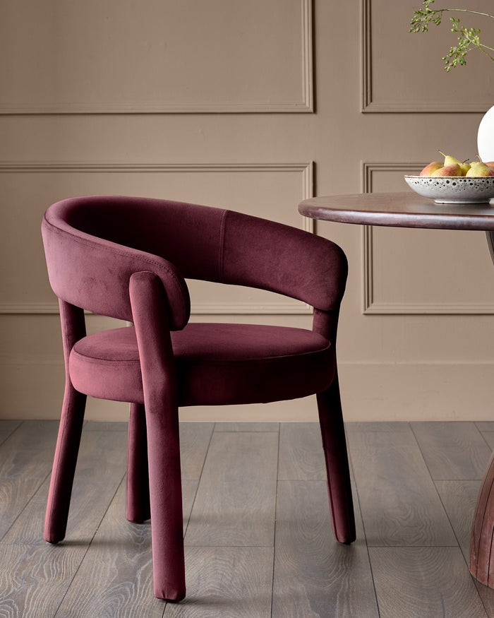
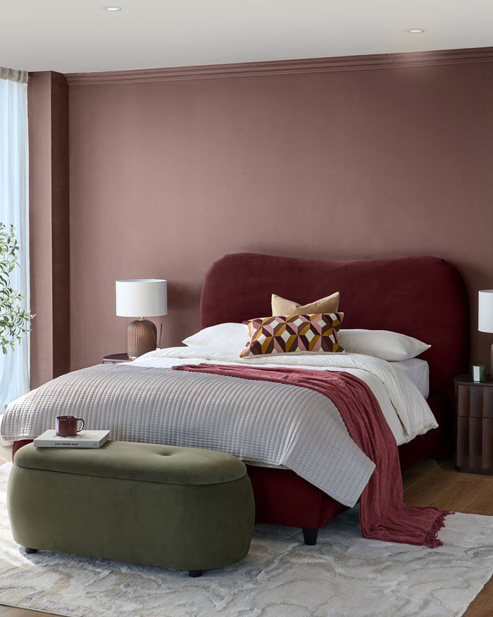
1. Earthy Contrast
In Colour theory, a contrasting scheme is when colours are opposite each other on the colour wheel and therefore complement one another. This is why olive green is the perfect contrasting colour to showcase Plum. Don’t think of opposite colours as clashing, they offset and therefore compliment each other – It’s the theory of opposites attract! A dark wall is a great go-to for a cosy lounge or bedroom, it will bring out the depth in the velvet, adding to the plushness. With a dark wall and a deeply toned bed or bed, keep the surrounding elements light with brass and lighter neutral colours.
This look works well with a full blend of finishes. Here we have used brass and olive green. The key here is to blend, not match.
Top Tip: Stick to one contrasting colour, like olive green, and use complementary colours for your accessories and accents, such as warm tones like amber or mango wood pieces like our Juniper bedside table.
2. Neutral Blush
 This look uses a blend of complementary, warm tones that sit on the same side of the colour wheel to Plum. Layering colours and tones that are near each other on the colour wheel gives a soft cohesive look, as opposed to a striking or contrasting one. All of the colours are on hues from the warm side of the wheel in various complimentary tones.
When choosing paint colours, for a complimentary neutral to Plum, opt for a beige with a warm base. Then, use warm tones in your accessories like warm browns, rust and metallic accents like rose gold and copper.
Top Tip: to keep a modern feel use black as an accent. A monochrome gallery wall and black accessories has the same effect of punctuating the scheme as a pop of colour would have.
Which look do you like the best? Thinking of introducing any of these colour schemes to your home? Let us know in the comments!